Meilisearch v0.30 is out and brings with it the ability to create numbered page selectors. You can read more about the new features and updates from v0.30 in our release blog post.
This article will go over the different ways of navigating search results and the pros and cons of each method.
What is pagination, and what are some common alternatives?
Let’s say you go to an ecommerce website to buy a new pair of shoes. It would be quite overwhelming if you got 700 pairs of shoes to choose from as soon as the page loads—not to mention that fetching every pair of shoes would certainly slow down the site.
To avoid this, most websites will break search results up into chunks, such as pages, and load a certain number at a time based on input from the user.
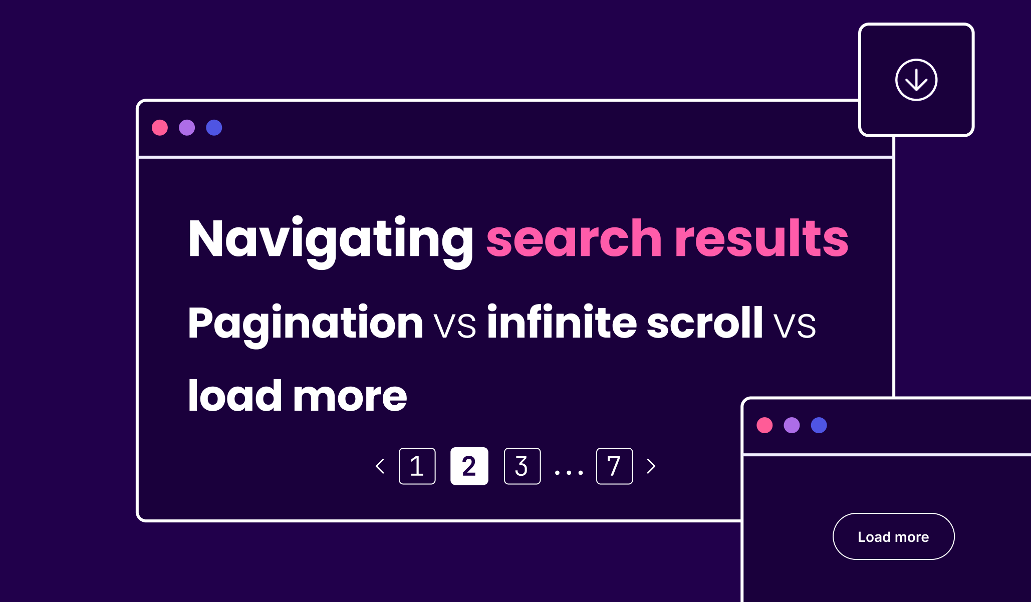
There are three main ways to display large datasets: pagination, infinite scroll, and load more. Each method has benefits and downsides that make it suited for certain use cases and content types. For example, Google’s use of numbered pagination makes it easier to find a specific result again, while Twitter, Facebook, and Instagram use infinite scroll to keep users glued to their screens. Google uses load more on mobile devices to display search results.
Changing from one type of pagination to another can completely alter user experience. Imagine waking up to a paginated version of Twitter, where you have to continuously click a “Next” button to view more posts in your feed (thanks, Elon). This would completely change the way you interact with the site!
In making the choice of how to display search results, you decide how much content to show users at one time, what action they have to take to view more, and how convenient it is to find a specific result again.
Pagination
Pagination works by breaking search results down into separate pages. There are two main types of pagination interfaces: numbered ones, where you find a list of numbered pages at the bottom of each page, and unnumbered ones, where you navigate from page to page using the “Previous” and “Next” buttons.
Pagination is one of the most popular ways to display search results and is particularly common on ecommerce websites. Pagination breaks down content, making it easier to process. Since each page is distinct, users can easily return to items they liked or share them with others. This helps users to search for something specific instead of browsing through a never-ending list of items.
The biggest downside to pagination is that most users don’t look beyond the first few pages and hence never get to look at more results. When was the last time you went to the second page of Google’s search results?

Since the results are replaced with every new page, users need to switch between pages to compare results. In addition, pagination isn’t very mobile-friendly. Mobile users prefer load more or infinite scroll as it’s more intuitive. It also requires additional actions from the user: clicking the “Next” button and waiting for the page to load. This may also give the impression that pagination is slow.
Numbered page selection
Page numbers add clarity to the search process and guide users to what they’re searching for. Numbered page selection offers numerous advantages, such as:
- Users can be shown the total number of pages of results, allowing them to estimate how long they will need to find a particular item. (“I have 25 pages worth of shoes to sift through!”)
- With numbered pages, it’s clear that some pages are more relevant than others. (“I didn’t find those shoes on the first five pages, so this website probably doesn’t sell them.”)
- Users can remember the positioning of an item, and numbered pages allow them to return to it faster. (“I liked the pink shoes on page 3.”)
- Users can generally stop in the middle of a session and continue from where they left off. (“I stopped at page 5 yesterday.”)

“Previous” and “Next” buttons
In numberless pagination, users navigate via “Next” and “Previous” buttons instead of a list of numbered pages. This alternative to numbered pagination is often used for mobile displays where there isn’t enough space to display page numbers. Since there are only two buttons, it offers less precision, as users can’t jump to specific pages. However, it offers better performance as it isn’t necessary to calculate the total number of search results.
Infinite scroll
Infinite scroll has become increasingly popular over the past decade due to the rise in smartphones. It loads more content seamlessly as the user scrolls, reducing friction. It’s also more intuitive than pagination; you just keep scrolling to view more content! Additionally, since all the content is loaded to a single page, it may seem faster than traditional pagination.

The biggest downside to infinite scroll is poor usability. The page length increases infinitely, making it difficult to find previously viewed results again, nor can users bookmark or share a particular set of items on the list. Page performance slows down as more content is loaded, making the page “heavier”. Meanwhile, the site footer may be inaccessible since infinite scroll pushes it endlessly down as more content is loaded. Since Googlebot cannot emulate scrolling, infinite scroll also has a negative impact on SEO.
However, the greatest impact by far is on user behavior. At some point, users of infinite scroll will stop paying attention to individual results and begin to focus more on scrolling, leading to decreased engagement. You can read more about this in Baymard Institute's study on design patterns for loading products on desktops and mobile devices.
Based on the above, infinite scroll may not be the best solution for ecommerce websites. How do you find the pink shoes you liked 15-ish scrolls ago?
There is one use case where infinite scroll cannot be beat. For entertainment websites whose main purpose is to keep the users with no particular aim on the page for as long as possible, infinite scroll all but guarantees a longer time on site. This is why infinite scroll is closely linked with social media and other business models that rely on advertising or data harvesting.
Load more
Like infinite scroll, load more is a mobile-friendly option that works by extending one page infinitely. However, unlike infinite scroll, load more allows users to choose whether they want to view more results by clicking a “Load more” button at the bottom of the page. This critical difference gives users more control, making it easier, for example, to access the footer or keep track of a specific result. Studies show that it also increases the amount of attention users give to each individual item.
Load more shares many downsides with infinite scroll, such as poor page performance. Like infinite scroll, it’s not ideal for SEO as Googlebot cannot click the “Load more” button. This means it cannot crawl or index all of your content.
So, what do I use?
The short answer: it depends on the kind of product experience you want.
Pagination
- Your users are looking for highly specific results
- SEO is very important to you
Infinite scroll
- You’re building a social media site
- Your users want to explore a large amount of content
Load more
- You want to hide your content behind a paywall
- You want to build an ethical mobile experience
- You want to gain some of the benefits of both pagination and infinite scroll
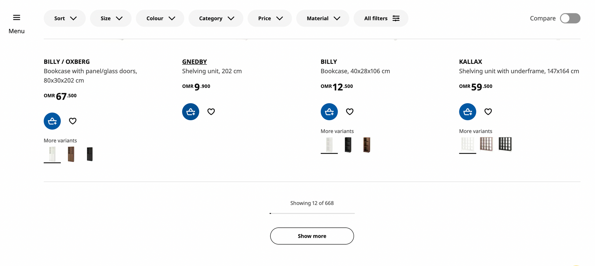
Or you could go hybrid! Consider Ikea: they use a load more button but also display the total number of search results and a progress bar, enabling users to see how many results they’ve viewed so far.

While we have covered the three main ways to display search results today, they are far from set in stone. At the end of the day, your goal is to help your users find the content they need. If you understand which key goals you want to accomplish with your search navigation interface and which pitfalls you want to avoid, you may be able to design something even better than what’s been done before. Good luck, and let us know what you create with Meilisearch!

